Font Smackdown

Socializing and general posts on wide-ranging topics. Remember, it's Poststructural!

Which font is the worst?

Comic Sans
0
No votes
Times New Roman
2
20%
Other
5
50%
I don't care
3
30%
I don't read
0
No votes
 
Total votes: 10

User avatar
mutepointe
Posts: 8151
Joined: Wed Jan 04, 2006 10:16 pm
Please enter the next number in sequence: 1
Location: kanawha county, west virginia
Contact:

Font Smackdown

Post by mutepointe »

1 Vote. Re-voting permitted.

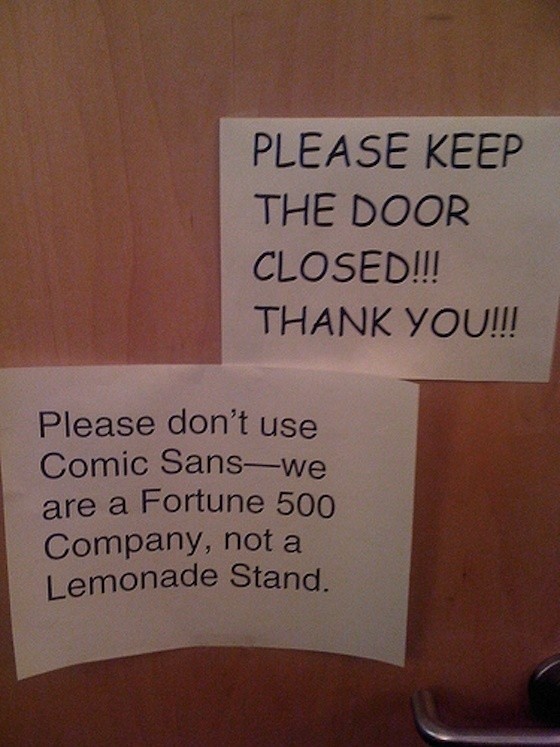
I will express my opinion later so as not to bias this most scientific of all smackdowns but I did want to post this Funny Picture:
Image
Rose tint my world. Keep me safe from my trouble and pain.
白飞梦
User avatar
emmline
Posts: 11859
Joined: Mon Nov 03, 2003 10:33 am
antispam: No
Location: Annapolis, MD
Contact:

Re: Font Smackdown

Post by emmline »

No. It seems like the worst one is Haettenschweiler. Very claustrophobic.
Image
User avatar
I.D.10-t
Posts: 7660
Joined: Wed Dec 17, 2003 9:57 am
antispam: No
Location: Minneapolis, MN, USA, Earth

Re: Font Smackdown

Post by I.D.10-t »

Depends on the environment and what is most legible.
"Be not deceived by the sweet words of proverbial philosophy. Sugar of lead is a poison."
User avatar
buddhu
Posts: 4092
Joined: Tue Sep 23, 2003 3:14 pm
Please enter the next number in sequence: 1
Location: In a ditch, just down the road from the pub
Contact:

Re: Font Smackdown

Post by buddhu »

The worst front by miles is the one I use for my handwriting...
And whether the blood be highland, lowland or no.
And whether the skin be black or white as the snow.
Of kith and of kin we are one, be it right, be it wrong.
As long as our hearts beat true to the lilt of a song.
User avatar
Innocent Bystander
Posts: 6816
Joined: Wed Aug 03, 2005 12:51 pm
antispam: No
Location: Directly above the centre of the Earth (UK)

Re: Font Smackdown

Post by Innocent Bystander »

It makes me laugh that there are graphic designers who want to ban Comic Sans. Snobs!
If by some fluke of misfortune they managed to succeed, what then? Ban Lucida Console? OCRB?

Granted they say all publicity is good publicity. I'm not sure it is good publicity if it makes them look like a whiney dog-in-the-manger. Maybe it's not stylish or fancy, but it's legible. Use it! Annoy these pontificators!

It's not difficult to make a font. I've made half-a dozen. If Comic Sans was struck down, a dozen similar fonts would rise in its place.
Wizard needs whiskey, badly!
User avatar
Innocent Bystander
Posts: 6816
Joined: Wed Aug 03, 2005 12:51 pm
antispam: No
Location: Directly above the centre of the Earth (UK)

Re: Font Smackdown

Post by Innocent Bystander »

And they used Arial in their response. Wooo! Imaginitive! :twisted:
(We all have our bugbears. I might have quibbled about the number of exclamation marks.)
Wizard needs whiskey, badly!
User avatar
mutepointe
Posts: 8151
Joined: Wed Jan 04, 2006 10:16 pm
Please enter the next number in sequence: 1
Location: kanawha county, west virginia
Contact:

Re: Font Smackdown

Post by mutepointe »

They're a Fortune 500 Company. They have exclamation points to burn.
Rose tint my world. Keep me safe from my trouble and pain.
白飞梦
User avatar
s1m0n
Posts: 10069
Joined: Wed Oct 06, 2004 12:17 am
antispam: No
Please enter the next number in sequence: 10
Location: The Inside Passage

Re: Font Smackdown

Post by s1m0n »

There needs to be a third sign saying 'actually, I am a door'.
And now there was no doubt that the trees were really moving - moving in and out through one another as if in a complicated country dance. ('And I suppose,' thought Lucy, 'when trees dance, it must be a very, very country dance indeed.')

C.S. Lewis
highland-piper
Posts: 913
Joined: Tue Nov 24, 2009 1:11 pm
antispam: No

Re: Font Smackdown

Post by highland-piper »

There are so many pathetic fonts from the 80's it would be hard to pick just one.

As far as fonts commonly abused, I think Comic Sans is near the top of the list. As far as commonly used fonts used for their appropriate purposes that I wish weren't used as much I might go with Arial.
dwest
Posts: 7113
Joined: Tue Aug 07, 2007 11:13 am

Re: Font Smackdown

Post by dwest »

I only use A and C fonts from folks like William Morris, Dard Hunter, Rennie Mackintosh. Really makes a business card pop.
User avatar
emmline
Posts: 11859
Joined: Mon Nov 03, 2003 10:33 am
antispam: No
Location: Annapolis, MD
Contact:

Re: Font Smackdown

Post by emmline »

With all due nods to the fact that this entire thread is tongue-in-cheek, what is an appropriate alternative to the overuse of a font such as Comic Sans or Arial? Do we randomly generate a font selection for each sign we post on the washroom door? Surely, if so, you are at great risk of incurring derision when Curlz comes up. Or consider this exchange:
Hey! Frank! Don't leave rotten sushi in the lunchroom fridge! Didn't you see the sign?
You mean THAT sign? It's in Wingdings!


Is any font safe????(extra ?s used for emphasis and annoying effect.)
User avatar
Innocent Bystander
Posts: 6816
Joined: Wed Aug 03, 2005 12:51 pm
antispam: No
Location: Directly above the centre of the Earth (UK)

Re: Font Smackdown

Post by Innocent Bystander »

Aye, Curlz is a good one. So is Jokerman, and Blackadder.
Kidnap can be really irritating. (hee hee!) The kids had a Harry Potter game which came with some pretty good fonts - I must see if I can dig them out.
One of my graphics apps comes with 500 fonts. I don't dare load them all. Now and then I download some of the display fonts. They're fun.

Do you remember the tombstone that Dubhlinn found, with text in Cursive Capitals that took us a few days to decipher? (I made a font file for that, and called it Epworth2 - I think Epworth was the name on the tombstone.)

You can always drive a graphics-snob crazy by sending them something all in Old English Capitals. :twisted:
Wizard needs whiskey, badly!
highland-piper
Posts: 913
Joined: Tue Nov 24, 2009 1:11 pm
antispam: No

Re: Font Smackdown

Post by highland-piper »

emmline wrote:With all due nods to the fact that this entire thread is tongue-in-cheek, what is an appropriate alternative to the overuse of a font such as Comic Sans or Arial? Do we randomly generate a font selection for each sign we post on the washroom door? Surely, if so, you are at great risk of incurring derision when Curlz comes up. Or consider this exchange:
Hey! Frank! Don't leave rotten sushi in the lunchroom fridge! Didn't you see the sign?
You mean THAT sign? It's in Wingdings!


Is any font safe????(extra ?s used for emphasis and annoying effect.)

The problem with Arial is that it's a poor Helvetica knockoff. If you have a need for a insipid font, go for the original instead of the knockoff. :moreevil:

I think Comic Sans is a great font -- for those occasions when you want to conjur up memories of Doonsbury or Superman. It's not an appropriate font for general use. :(

In our office we use Myriad now for most purposes. We had been using Garamond previously.
User avatar
mutepointe
Posts: 8151
Joined: Wed Jan 04, 2006 10:16 pm
Please enter the next number in sequence: 1
Location: kanawha county, west virginia
Contact:

Re: Font Smackdown

Post by mutepointe »

Fonts project image and style. I find Times New Roman a particularly harsh & ugly font. I would like to find the person who decided to make that the default font for Word and yell at them. I think Arial is used for the accessibility issues. I'm not fond of that font either. That font and all its variations totally lack style and grace. Out of all the installed fonts in Word these days, I've chosen Goudy Old Style as my signature font. Similar to Times New Roman that no one who is not font obsessed would notice the difference but it has a grace to it that doesn't jump all the way over to a ladies font. Calibri showed up as the default font in Outlook and I can live with that one too. That font has the simplicity of Arial without the harsh blockiness.

The older versions of Word or Corel WordPerfect had a font like the titles of the TV Show Ellery Queen. I really like that font but a person can't write business letters in that font. One of the downsides of obscure fonts is that the receiving person has to have the same font.
Rose tint my world. Keep me safe from my trouble and pain.
白飞梦
User avatar
mutepointe
Posts: 8151
Joined: Wed Jan 04, 2006 10:16 pm
Please enter the next number in sequence: 1
Location: kanawha county, west virginia
Contact:

Re: Font Smackdown

Post by mutepointe »

emmline wrote:No. It seems like the worst one is Haettenschweiler. Very claustrophobic.
Image
This font can do nice stuff in TextArt.
Rose tint my world. Keep me safe from my trouble and pain.
白飞梦
Post Reply